Trust in UX: 9 Design Patterns for Fintech and Marketplaces
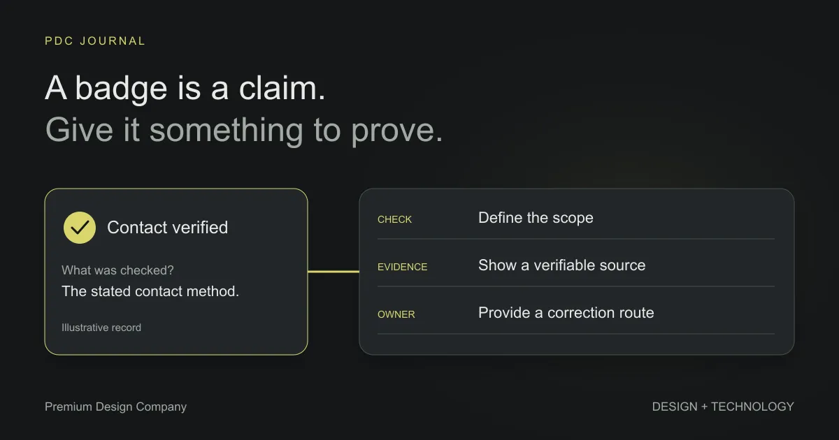
People trust a product when its screens let them check the things they doubt: who is behind it, whether the facts are real, and how to reach a person if something goes wrong. Trust badges and “trusted by thousands” banners don’t do that. Specific, checkable facts in the right place do.
This matters most where money or reputation is at stake: fintech apps, investment platforms, B2B marketplaces and directories. Below are 9 patterns for making those checks easier. The examples come from interface designs by our founder, Masum Rana, during his freelance work before PDC was founded in 2025. They demonstrate presentation patterns, not verified investment safety, security or measured changes in user trust.
Why do users distrust fintech and marketplace products?
Because the cost of being wrong is high, and they have usually been burned before, or know someone who has. Crypto is the extreme case: fake projects, fake announcements and pump-and-dump schemes are common enough that every new listing starts out under suspicion. B2B marketplaces have a milder version: is this supplier real, and will they actually ship?
The useful insight is that this suspicion is specific. Users don’t distrust you in general; they have particular questions. Good trust design finds those questions and answers them on the screen, before the user has to ask.
Much of this is old, well-tested advice. The Stanford Guidelines for Web Credibility, published by B.J. Fogg’s lab in 2002, include “make it easy to verify the accuracy of the information on your site”, “show that there’s a real organization behind your site” and “make it easy to contact you”. The patterns below are what those principles look like inside a product.
1. Answer the first question a cautious user asks
Find the one or two questions that decide whether a user takes the next step, and answer them in plain words on the page.
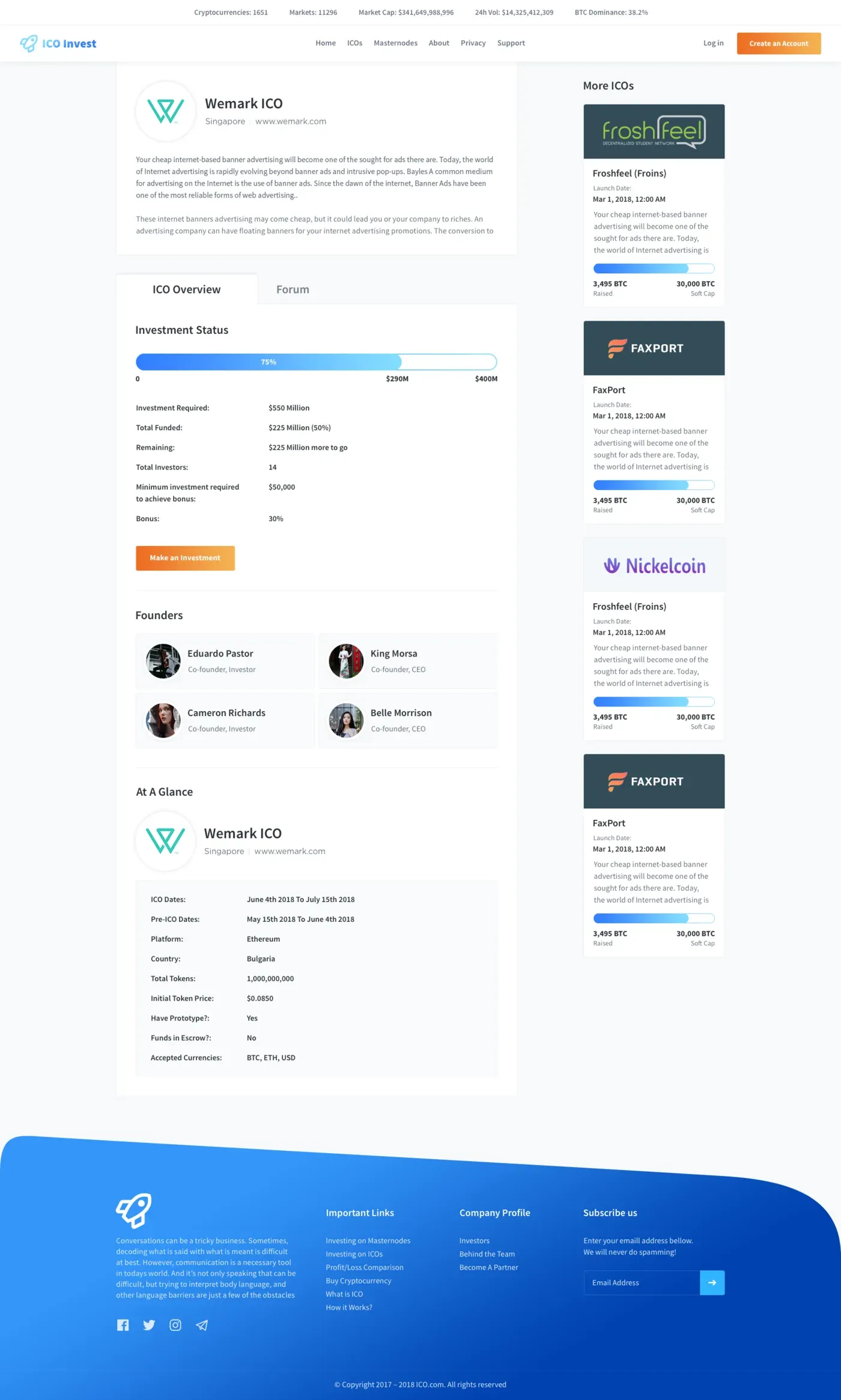
On ICO Invest, a platform for discovering token sales and masternodes, those questions are “does this project have a working product?” and “is my money protected?”. So every listing has two plain lines in its fact sheet: Have prototype? and Funds in escrow?, each answered yes or no.
Notice that the example in the final design answers “No” to escrow. That is the point. A field that can say “no” is what makes “yes” believable. If every listing showed only good news, cautious users would assume the bad news was hidden.
2. Show the people behind it
Put real names and faces on the people who are accountable. An anonymous product asks for blind trust; a named team gives users something to check.
Every ICO Invest listing shows its founders with photos and roles, right under the investment status. An investor can search their names, look at their history and decide for themselves. A named team gives users a starting point for verification; names and photos can also be copied or fabricated, so they are not proof of legitimacy.
For your own company, use accurate team information, named authors and a contact route you actually maintain. Describe locations honestly; do not invent an office address to look established.
3. Show the source, so users can verify it
When you show a claim users can’t easily check, link to where it came from. Let them verify instead of asking them to believe.
Token Alerts is a crypto trading dashboard with a calendar of upcoming coin events, such as a coin being listed on new exchanges. These announcements are easy to fake, and fake ones move prices. So each event card shows its proof and its source, not just the claim. A trader can follow the trail before acting on it.
This is the first Stanford guideline in product form: make accuracy easy to verify.
4. Let the community weigh in, and label it as opinion
Where you can’t verify something yourself, the people who use your product often can. Give them a way to say so, and show the result clearly as opinion, not fact.
Token Alerts adds a community vote to each event: real or fake. A trader sees both the source (pattern 3) and what other traders think of it. Keep the two visually distinct in your own product, so a popular rumour never looks like a confirmed fact.
One caution if you build this: votes can be gamed. Decide early who can vote (only signed-in users? only users with trading history?) and design those rules in from the start. Retrofitting them is harder.
5. Flag the bad ones, not just the good ones
Most products only highlight the best listings. Trusted products also warn you about the worst.
The Token Alerts ICO list groups token sales as hot, active, upcoming, ended, or flagged as scams. That historical interface label should not be copied without an evidence and review process. For a new product, distinguish a confirmed policy violation from an unverified report, explain the basis for the status and provide a correction or appeal route.
For a marketplace, the equivalent might be showing suppliers with late deliveries, unanswered disputes or expired certificates, not just top-rated ones.
6. Make verification visible everywhere
If you verify users or businesses, show that status everywhere they appear, not just on their profile. And make it as easy for your own team to manage as it is for customers to see.
Supplyr is a directory where suppliers and manufacturers find each other. Its admin dashboard shows verified or unverified status in every user table. Each business profile puts the verification checklist (phone, documents, security questions) right next to the verify, unverify and delete buttons, with internal notes for staff.
This is the side of trust design that customers never see. Explain what the badge verifies: identity, contact details or documents are different checks. Show relevant dates or expiry where appropriate. Verification of identity does not establish product quality, solvency or a guarantee of delivery. Design the admin tools as carefully as the public pages.
7. Use the same format for every listing
Show the same facts in the same order on every listing, so users can compare fairly and missing information stands out.
On ICO Invest, every ICO and masternode has an “at a glance” fact sheet in one fixed format: sale dates, platform, country, token supply, price, prototype and escrow. Investors comparing several projects scan one column instead of re-reading each page. And when a project leaves a field blank, the gap is obvious, because every other listing has it filled.
Supplyr does the same at listing creation: every listing asks for average transaction size, expected growth, international shipping and a money-back guarantee. Buyers get the facts they filter on, and both sides save a round of emails.
A fixed content format is a design system decision too, as we explain in our post on design system ROI. It is also fairer to honest sellers. They can’t be outshone by someone with a slicker free-form description.
8. Never hide the way to reach a real person
Make the intended contact route easy to find while respecting the permission and privacy choices behind published contact details. Hard-to-find contact information reads as “we don’t want to hear from you”.
On Directory Listing, a Swedish directory for finding businesses and people, every result shows the phone number in full, in colour, with no “click to reveal”. On a directory, calling is often the whole goal.
For a fintech product, provide a visible support route inside the app and only state a response time the team can support.
9. Show that the product is alive, honestly
People trust products that other people are visibly using. A real activity feed or public page can show that, as long as every number in it is real.
The ICO Invest homepage includes a feed of recent transactions. Token Alerts has a public alerts page for visitors who haven’t signed up, showing recent alerts and coin prices. These screens illustrate an activity-feed pattern. The sample numbers in portfolio mockups do not establish real transactions, trading performance or a live service; production feeds need genuine data and appropriate disclosure.
The important word is honestly. A fake activity feed or an inflated user counter is worse than none, because users who spot one fake number stop believing all the others.
What doesn’t build trust?
Some common “trust” elements do very little, in our view, because they make claims users can’t check:
- Generic security badges that aren’t linked to anything verifiable
- “Trusted by thousands” with no names, logos or numbers behind it
- Stock photos of handshakes and smiling teams
- Testimonials whose source, context or permission cannot be established; a photo or full name is not always appropriate
Each of these asks the user to take your word for it. The patterns above work because they don’t.
Make the trust claim match the operation
Before adding a security statement, verification badge or response-time promise, ask who owns the underlying process and what evidence supports it. A well-designed badge cannot compensate for a check nobody performs.
For each claim, record its meaning, evidence, owner and review date. Include how users can report an error. Keep opinion, demonstration content and confirmed facts visually distinct. If a process changes, update its public description rather than leaving an old promise in place.
Trust audit checklist
Run your product against this list. Each “no” is a question your users are asking that your screens don’t yet answer.
| Pattern | Question to ask | Shown in |
|---|---|---|
| Answer the first question | Do listings answer the main doubt, including with a “no”? | ICO Invest |
| Show the people | Can users see who is accountable? | ICO Invest |
| Show the source | Can users check where each claim came from? | Token Alerts |
| Community opinion | Is user opinion shown, and kept separate from fact? | Token Alerts |
| Flag the bad ones | Do you warn about poor listings, not just promote good ones? | Token Alerts |
| Visible verification | Is verified status shown everywhere, and easy for staff to maintain? | Supplyr |
| One format | Does every listing show the same facts in the same order? | ICO Invest, Supplyr |
| Easy contact | Can users reach a person without searching? | Directory Listing |
| Honest activity | Is every public number real? | ICO Invest, Token Alerts |
Many of these patterns live in dashboards and data tables. For the layout side of that work, see our 10 dashboard design rules.
Want a product people trust?
We design fintech platforms, marketplaces and directories, from the first wireframe to production code. See our web design service, our monthly plans, or book a free call to talk through where your users hesitate.